Podcast and RSS Reader App Design
I've been developing an app for reading RSS feeds and listening to podcasts for personal use recently, and I finally had some inspiration as far as the design goes. Though it's ever-changing, here's a preview of the design at this point
The app is meant to provide a reading space for RSS feeds as well as allow a user to bookmark articles and tweets for later reading. In addition, it provides a way to listen to podcasts while browsing other content that's been added in a way that feels consistent and easy to use across all platforms
Mobile
I've tried to remove anything that's not absolutely essential from the overall app with the goal of preventing clutter on the mobile app. In order to do this I've made the bottom navigation something that adapts and shows the user relevant actions based on the screen they're on as opposed to providing a combination of local and global menus as is normally seen in mobile apps
For the navigation I'm liking the idea of a static bottom navigation that transforms and adapts as the user moves through the app - this is a decision that's persisted with the desktop design as well because of how it aids in delivering a cohesive cross-platform experience
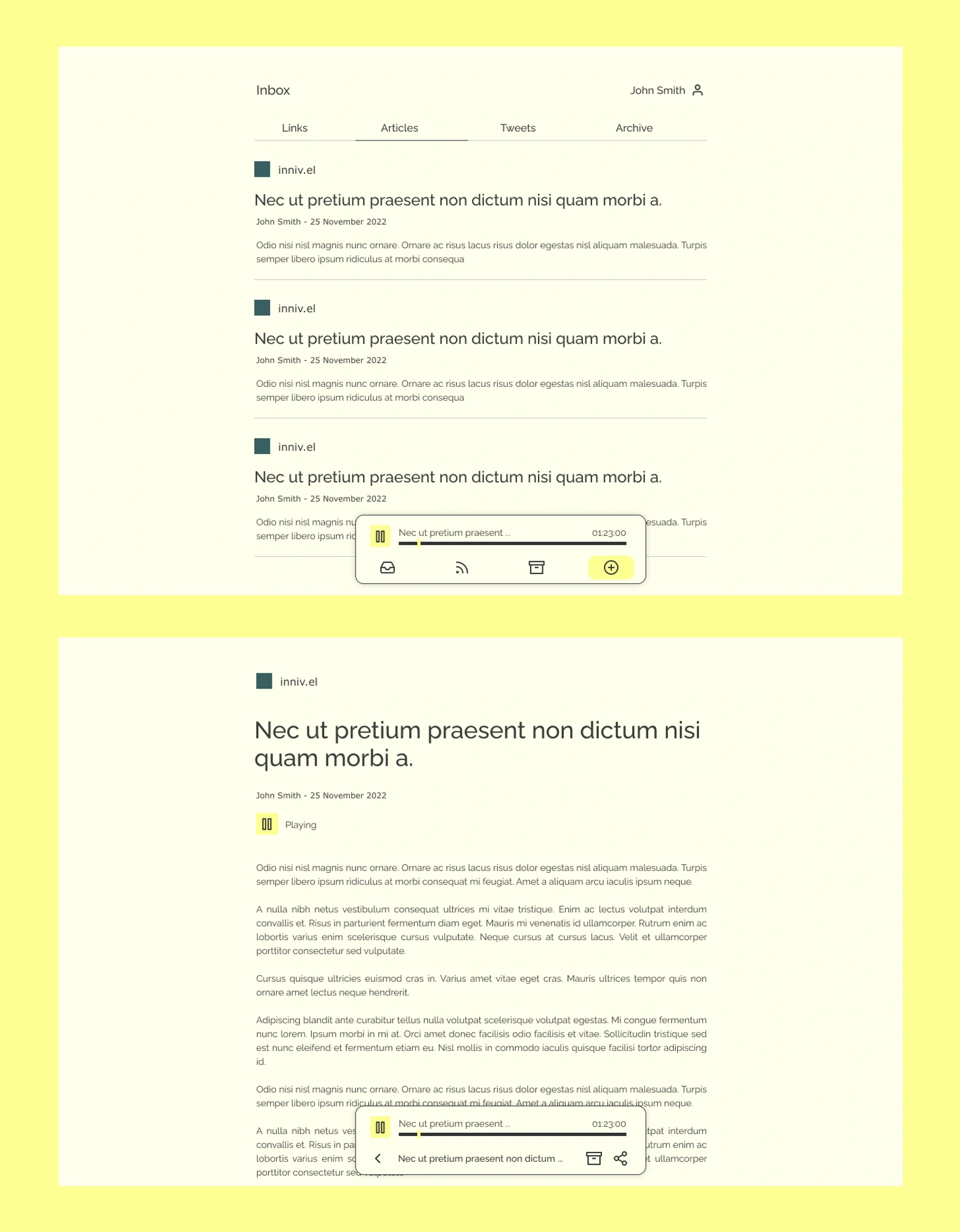
Light
For the light theme I've settled on a warm-ish background to link up with the idea of "highlighting" when reading as one might do on paper
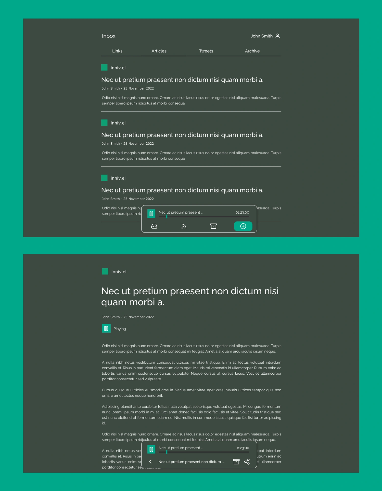
Dark
For the dark color scheme I wanted to bring something interesting to the color palette since the typical "black" style was feeling boring. I figured color was a way to add some interest to the relatively text-heavy UI and the green was chosen for the feeling of comfort it brings which should bring a softer feel for reading
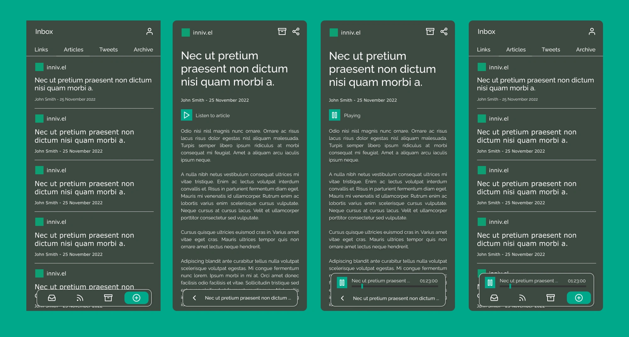
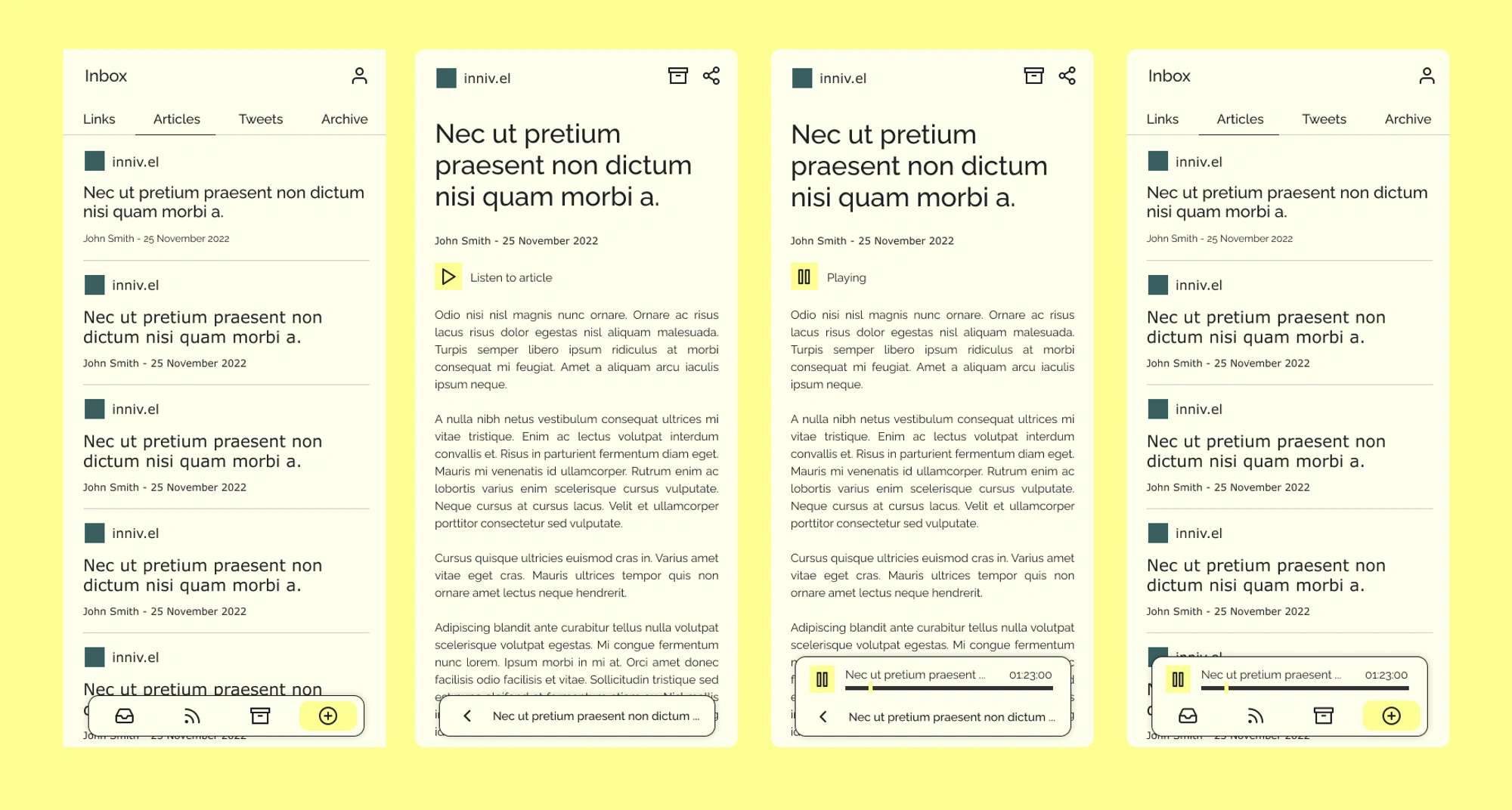
Desktop
For the desktop view my focus was to keep things pretty minimal and reduce the visual noise, focusing on the reader experience while being consistent with the mobile view, offering some simple style and layout modifications to better make use of the available space
As far as the inbox view goes, there are some simple tabs at the top that allow switching between the different article types as in the mobile case but aside from some spacing and font size tweaks everything else is pretty much aligned to the mobile style
For the article view I'm taking advantage of the added space in the bottom to add some of the actions that are at the top of the screen in the mobile view - this helps make better use of the space and keep the reading canvas clean as well as isolate actions into a single place which should make it easier to navigate around the app using a mouse
Light
Dark