Looky, a wild HTML!
01 October 2019
Updated: 23 December 2025
Here at last
So, after far too long, we are here. A mostly-functional website, that I have not tested on a single iOS device which may prove to be problematic
Note to self, test on an iPhone or something
For the past six months or so I’ve looked at myself with a full stack of irony knowing that I, a web developer, do not have my own website. Or well, not one I’d actually want anyone to see (*cough cough* I’m talking to you, Weebly)
The Design Process
Well, the design process, especially when you’re trying to satisfy your unattainable standard of perfection, can be difficult. I actually ran through a shocking number of iterations and end-to-end redesigns but I just could not seem to find something that satisfied me. Until one day, it all just sort of hit me at once
None of this nonsensical “cards and shadows” drama, no random floopy animations, none of that, just a blank slate, with some text and imagery.
I think I have a fair stock of those
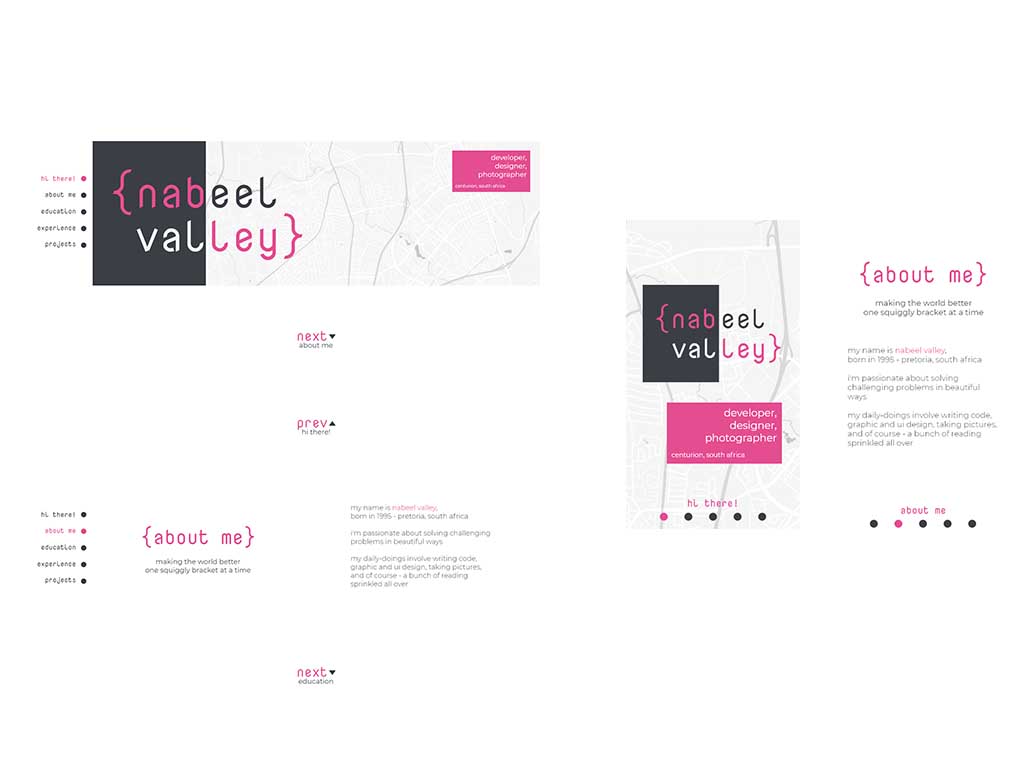
Design v1
The first iteration that I have saved is this one, I had big dreams, there were going to be things moving all over the place, I was going to break the norm with horizontal scrolling, and just basically turn the site into a slide-show. But I didn’t like the lack of fluidity with the overall design. Regardless, here are the first few screens:

During this initial phase I had sort figured out what my key goals were:
- Unique experience on every device.
- Unobtrusive elements
- Clean lines
- I needed to take emphasis away from the design, and onto the content
Basically, I wanted something basic
By now I had decided on the three most important things, #E44D90, Montserrat, and Nova Mono, but there’s still a lot I was unsure of
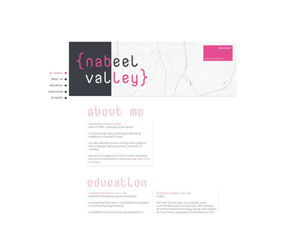
Design v2
This version mostly morphed out of the first one, I was trying to address two things primarily
- How can I not confuse people
- Actually yeah, just the first thing
Personally, I hate this design. But It was definitely valuable in telling me what I didn’t want this site to be

I’ve always disliked cards, and abusing it the way I was in that further deepened my hate. I felt kind of like “Well if everyone else does it, maybe I should give it a shot?”, to be fair it’s probably not the cards, it’s me
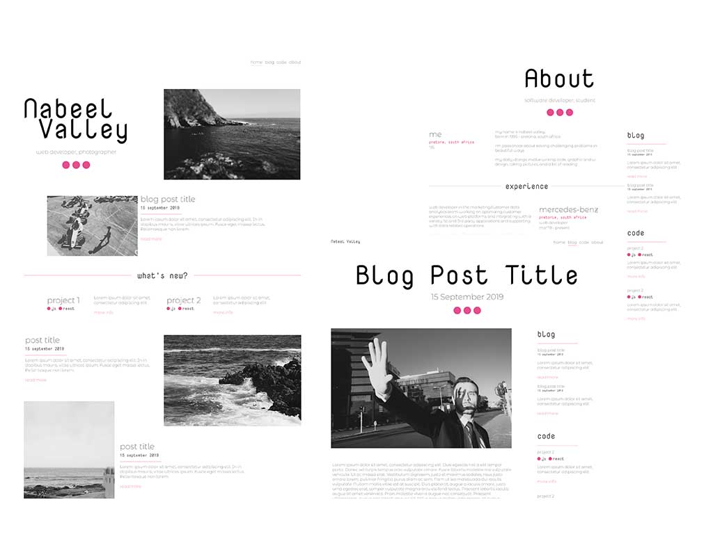
Design v3
This is what you’re seeing now (Assuming you’re reading this in October 2019) I love how this design places a strong emphasis on the imagery and text, there isn’t really much else in the way of it aside from occasional underline. Simplicity
I addressed my remaining goals by sticking to a basic site layout with a fairly aggressive grid to deliver interesting layouts for different devices

That being said, and my heart being content. It was time to code
The “Bashing your head against a wall” Process
I used React - Why? Because I used React. Sure, I could have went the Server-Side route and made sure I was sending normal HTML to people, but I wanted a sustainable component library that I could develop as well as super-quick responsiveness on the client, and from experience, I knew I could knock this out fastest with React. That being said, I kind of wish I had looked at setting up pre-rendering before I started, because I feel like it’s going to be admin to add after (will basically need to refactor out all the <Suspense/>) tags
Now, as any front-end developer should know in 2019, you gotta start with npx create-react-app my-app and after about three years of node_modules you’re ready to go
Content Management System?
I’m not going to go into the details of the development because there isn’t really anything too fancy going on here - the site is mostly static anyway. I will however just talk about the Content Management System
Well …, I think it depends on your view of a CMS. I really didn’t want to go overkill on this so I’m making use of a fairly simple system. Each post consists of a post.md and a post.json file
The .md file is the Markdown file, it’s the file that I write in as I write the post, and potentially every post in future
The .json file is also very simple at the moment and contains some metadata for the post such as the title and the date. I made this separation so that I would not have to get funky with my file processing, and I’m fairly happy with it
To process and render the Markdown I’m using a library that I fell in love with just over a year ago called Showdown.js, and to add syntax highlighting I’m using some flavour of Highlight.js
I’ve then simply rendered the content by fetching it from the Folder-cms and passing it through a Markdown Component
1import React from 'react'2import { Converter } from 'showdown'3import * as showdownHighlighter from 'showdown-highlight'4
5import './Markdown.css'6
7const convertMarkdownToHtml = (text) => {8  const converter = new Converter({9    headerLevelStart: 2,10    parseImgDimensions: true,11    extensions: [showdownHighlighter],12  })13  const html = converter.makeHtml(text)14  return html15}16const Markdown = ({ text }) => (17  <div18    className="Markdown"19    dangerouslySetInnerHTML={{ __html: convertMarkdownToHtml(text) }}20  ></div>21)22
23export default Markdown
And that’s pretty much it. It gets rendered into the page you’re looking at now and that’s all it takes really. It’s a bit of a shame that my syntax highlighting CSS theme doesn’t really do justice on JS, another TODO I suppose
Conclusion
There were a couple of new things I learnt during this entire process, simple little things really like how to change the colour of the scrolly thing on your browser, or how to put together a mildly-reasonable file system to store the posts, but more than anything I enjoyed being able to just take something from pure concept to a final build that lines up pretty well with my initial vision
That’s all for now, stay tuned, lots more to come. But in the mean time take a look around, let me know what bugs you find (as I said, very untested)
Nabeel Valley